Lovely vid but that narrative is absolute word salad. I can't be the only one wondering what the hell, 'The city that worked tirelessly through adversity whilst our dreams and hopes became stronger,' means?

You are using an out of date browser. It may not display this or other websites correctly.
You should upgrade or use an alternative browser.
You should upgrade or use an alternative browser.
General 2020/21 New Kit
- Thread starter n1
- Start date
Emilio
Well-known member
- Joined
- 3 Feb 2018
- Messages
- 1,429
There can't be that many who have supported the club since '49 and can also successfully use an online forum! Fair play to you old chap ?This should be our home kit which we wore until 1969 ( correct me if i am wrong ) the same colours that Wolves play in. Having supported the club since 1949 i was gutted when they changed, we have had some shocking yellow kits over the years although recent ones have been good.
And in response to your query:

Last edited:
Golden Dr Otto
Well-known member
- Joined
- 3 Sep 2018
- Messages
- 3,168
Lovely vid but that narrative is absolute word salad. I can't be the only one wondering what the hell, 'The city that worked tirelessly through adversity whilst our dreams and hopes became stronger,' means?
Worryingly like the awful song that the Thai owners made for Reading FC
IsleofWightYellow
Well-known member
- Joined
- 20 Dec 2017
- Messages
- 8,644
Worryingly like the awful song that the Thai owners made for Reading FC
Nowhere near as bad!!
"With our might, we'll defend the glory of Reading"Worryingly like the awful song that the Thai owners made for Reading FC
Third kit all white?
Or like this blue/white combo (obviously design different):
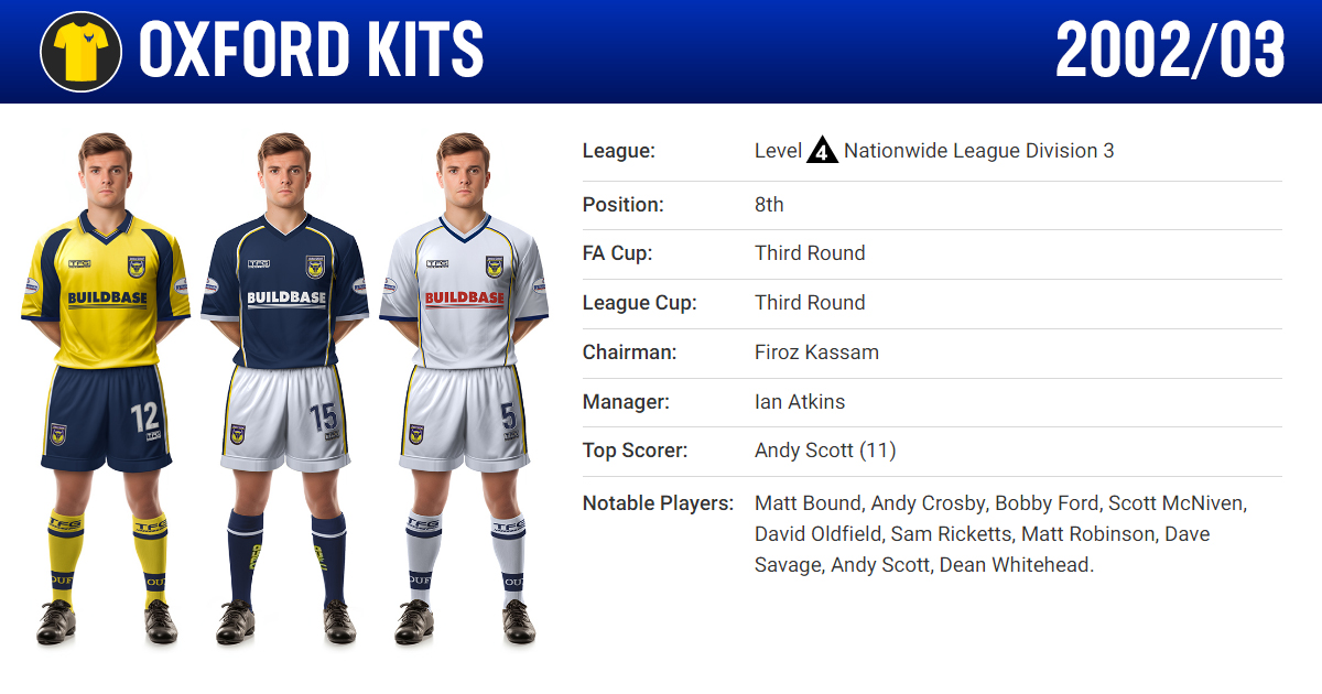
Oxford United Kit History | Season 2002/03
An illustrated historical record of Oxford United's match-worn football kits featured during the 2002/03 season. Includes all kit variations and sponsor details.
 oxfordkits.com
Bath Yellow
Active member
- Joined
- 23 Jun 2020
- Messages
- 860
Thanks for your info regarding the change of colour, wasnt quite sure when it was.
Emilio
Well-known member
- Joined
- 3 Feb 2018
- Messages
- 1,429
Oh dear lord that is atrocious...
 ?
?How horrendously embarrassing...made all the better that it's the Plastics ?
Dubai Yellow
Active member
- Joined
- 9 Dec 2017
- Messages
- 804
Great away kit! ??
ChamonixOx
Well-known member
- Joined
- 21 Jan 2018
- Messages
- 1,018
1970 - three years old when I went to watch the U's and Hugh Curran! For those of us bought up in the 60's and 70's, at the U's will always be Gold and Black so great ideal to keep the 'now traditional' yellow at home, but use the 'old traditional' gold away. Clever marketing of course too as good excuse for justifying a third kit on the rare occasions both clash!
Last edited:
As a person with colour blindness (red/green deficiencies), the green gk kit and all yellow kit in previous photos is a bit of an issue.
Whats usually more of an issue is when opposing teams play in the same tone, such as an all red kit v an all dark blue kit.
I think 1 in 10 males have some form of colour blindness, so am always surprised that those who deal in graphics and design seem to ignore it.
Whats usually more of an issue is when opposing teams play in the same tone, such as an all red kit v an all dark blue kit.
I think 1 in 10 males have some form of colour blindness, so am always surprised that those who deal in graphics and design seem to ignore it.

behindthegoal
Well-known member
- Joined
- 7 Dec 2017
- Messages
- 1,664
Have you looked at both shirts side by side???Wouldn't orange be too close to the yellow kit?
Can't you tell the difference???
Golden Dr Otto
Well-known member
- Joined
- 3 Sep 2018
- Messages
- 3,168
As a person with colour blindness (red/green deficiencies), the green gk kit and all yellow kit in previous photos is a bit of an issue.
Whats usually more of an issue is when opposing teams play in the same tone, such as an all red kit v an all dark blue kit.
I think 1 in 10 males have some form of colour blindness, so am always surprised that those who deal in graphics and design seem to ignore it.
Person of Colour Blindness Lives Matter
 ?
????????
Have you looked at both shirts side by side???
Can't you tell the difference???
Not enough in comparison to an opponent's kit as mentioned by somebody else earlier.
ZeroTheHero
Well-known member
- Joined
- 7 Dec 2017
- Messages
- 9,266
I am really not convinced that bright orange is much like the 'old gold' - it's more like the Headington Utd orange on steroids!1970 - three years old when I went to watch the U's and Hugh Curran and co! For those of us bought up in the 60's and 70's, at the U's will always be Gold and Black so great ideal to keep the 'now traditional' yellow at home, but use the 'old traditional' gold away. Clever marketing of course too as good excuse for justifying a third kit on the rare occasions both clash!
Emilio
Well-known member
- Joined
- 3 Feb 2018
- Messages
- 1,429
Agreed. More of a Luton Town orange.I am really not convinced that bright orange is much like the 'old gold' - it's more like the Headington Utd orange on steroids!
Similar threads
- Replies
- 843
- Views
- 74K