
You are using an out of date browser. It may not display this or other websites correctly.
You should upgrade or use an alternative browser.
You should upgrade or use an alternative browser.
General 2023/24 - Kit Launch
- Thread starter Ox4Eva
- Start date
Older Shotts
Well-known member
- Joined
- 22 Jan 2018
- Messages
- 1,169
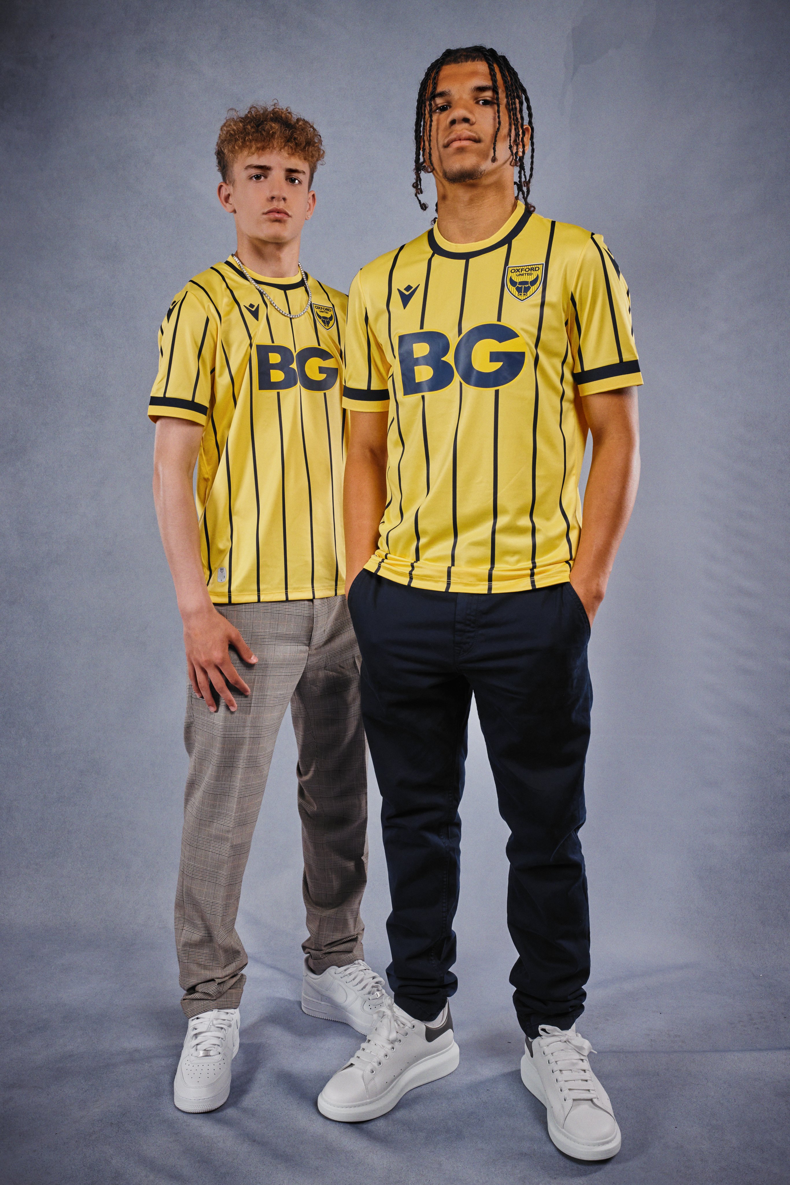
Yellow on the BG is dire too - its brighter than the shrt, looks cheap and nasty.
What was a great shirt on first look is getting worse for me :-(
Will still buy all 3, but am now disappointed.
What was a great shirt on first look is getting worse for me :-(
Will still buy all 3, but am now disappointed.
Paul Cannell
Well-known member
- Joined
- 7 Dec 2017
- Messages
- 7,484
Shirts looks like it's for a waiter at a 24-hour Boston coffee shop in the Combat Zone.
Wandering Yellow
Well-known member
- Joined
- 10 Aug 2019
- Messages
- 5,588
The song gives me a headache but I quite like the kit. The yellow is fairly pale as some have mentioned but I think the pin stripes are smart.
Wandering Yellow
Well-known member
- Joined
- 10 Aug 2019
- Messages
- 5,588
One question I have is why they would put BG on a different shade of yellow to the kit. That's madness, surely?
Mythbuster3000
Active member
- Joined
- 18 Jul 2019
- Messages
- 212
Are the pinstripes blue or black? To me, they look black.
Are the pinstripes blue or black? To me, they look black.
Ah, the age old debate.
bazzer9461
God like member
- Joined
- 6 Dec 2017
- Messages
- 40,686
And with the cost of living crisis and the price why haven’t the marketing team try and do an incentive to purchase one if not more of the replica kits?
Yellowoptimist
Active member
- Joined
- 13 Dec 2017
- Messages
- 148
It looks smart. Full kit will be impressive. Really dont understand any of the negativity to be honest but everybody has a preference and opinion
West Oxon U’s
Well-known member
- Joined
- 14 Dec 2017
- Messages
- 9,249
Don’t think the bright yellow around the BG logo is a problem at all - if anything it makes the logo look much better compared to last season’s.
Looks a nice clean shirt to me and far, far better than I thought it would. It will sell well I would say.
I like the fact the stripes are not on the reverse of the shirt too. As someone earlier stated - numbers and stripes don’t work !
Looks a nice clean shirt to me and far, far better than I thought it would. It will sell well I would say.
I like the fact the stripes are not on the reverse of the shirt too. As someone earlier stated - numbers and stripes don’t work !
Chippy
Well-known member
- Joined
- 9 Jul 2022
- Messages
- 1,549
Got to say I’m a bit disappointed. I don’t dislike it and may well buy one as I usually do, but it’s a bit like going back to an old style design from 25-30 years ago with pin stripes. With so many funky designs and options available these days I think we’ve missed a real trick here, especially in terms of shirt sales opportunities. A really jazzy design would say buy me and appeal far more to the younger fans as well.
We could have had something far more appealing. Just my view and everyone has their own tastes, but when I look at other kits and designs, I feel ours is a bit of a let down this time and doesn’t have that must buy appeal.
We could have had something far more appealing. Just my view and everyone has their own tastes, but when I look at other kits and designs, I feel ours is a bit of a let down this time and doesn’t have that must buy appeal.
I like it. It’s nothing dramatic, but after last years somewhat odd, jazzy number and some (IMO) un-noteworthy kits in recent years this one is pretty smart.
I really like the rumoured AC Milan-esque away kit though so suspect I’ll save my pennies to pick that one up in all honesty.
I really like the rumoured AC Milan-esque away kit though so suspect I’ll save my pennies to pick that one up in all honesty.
OUFCGav
Well-known member
- Joined
- 6 Dec 2017
- Messages
- 2,328
those aren't stock designs. so custom led by people from the club - and on this year, people with a retro head on.I seriously wonder who decides on the final designs. Macron have created some cool looking designs for other teams. Ours looks like it took all of 3 mins to design!
Mythbuster3000
Active member
- Joined
- 18 Jul 2019
- Messages
- 212
I LOVED last season's home shirt. However, the more I look at the new one the more I think it tops it!
Pompeyyellows
Well-known member
- Joined
- 7 Dec 2017
- Messages
- 1,574
I like it and will be getting 1. I like the idea that it resembles an 80's kit. Reminds me of the Sunday People sponsored 1, 1st replica i brought.
Orkney Islands Yellow
Well-known member
- Joined
- 13 Dec 2017
- Messages
- 7,145
I like it.
MJB
Well-known member
- Joined
- 6 Dec 2017
- Messages
- 7,953
Yep, I’d be much more likely to get one without the sponsor. But then, there’s not much point in someone sponsoring the shirt.I like the kit but the sponsors logo is way too overpowering once again. Wish we could buy the kit without the logo on.
Shame it’s not a beer logo again - otherwise you could have slimmed down over the summer and bought a kids sized kit!
Pompeyyellows
Well-known member
- Joined
- 7 Dec 2017
- Messages
- 1,574
Just collected mine from the club shop .
Very simple design, but does look good in the flesh .
Whats it like for fit? is it like last years where you needed to go 2 sizes bigger to get it to fit half decent?
Similar threads
- Replies
- 843
- Views
- 75K